Highlights
-
With spring comes an influx of homes on the market – new listings were up 44% in March, and month-end available inventory was up 81%.
-
Still a strong seller’s market, most homes went under contract after the first weekend and closed on average $43k over list price.
-
The average sales price in Denver metro surged above $700k for the month, driven in part by a 69% increase in homes sold over $750k.
Inside the Numbers
Sales Price
-
$705,812 average sale price for a home purchased during the month.
-
$602,750 half of the homes sold were purchased for this amount or less.
-
$42,829 average amount over the list price for homes closed during the month.
Average sales price continues to push historically high levels, as does the close-to-list price ratio (106.46%).
Days on Market
11 average number of days for a home to go under contract during the month.4 half of the homes listed were under contract in this number of days or less.
Homes went under contract 3 days faster on average than in previous months, while most new homes still go under contract the first weekend.
Inventory Movement
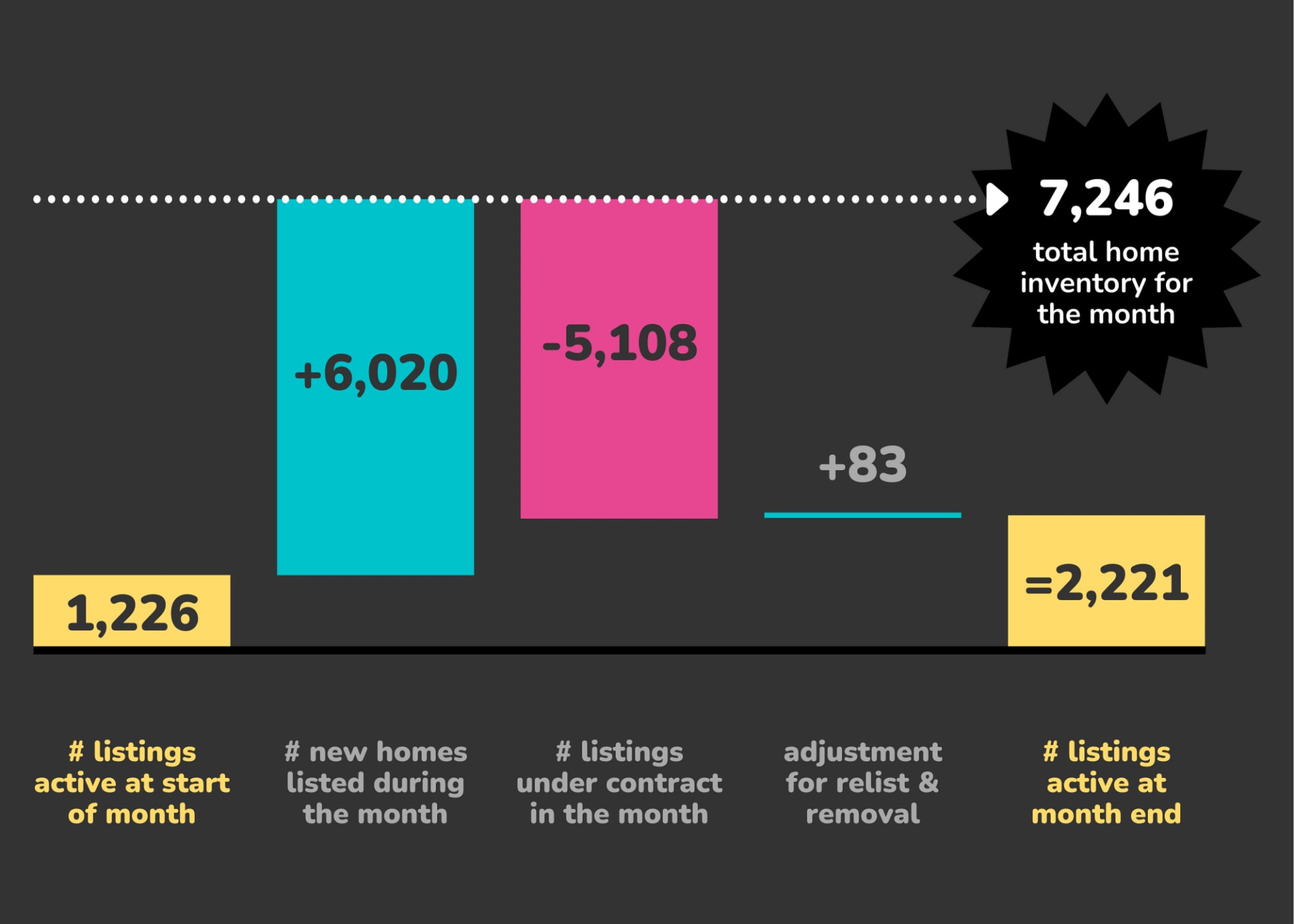
An influx of new listings in March provided some relief for buyers starved for inventory, and month-end available listings is up 81%.
Homes Sold
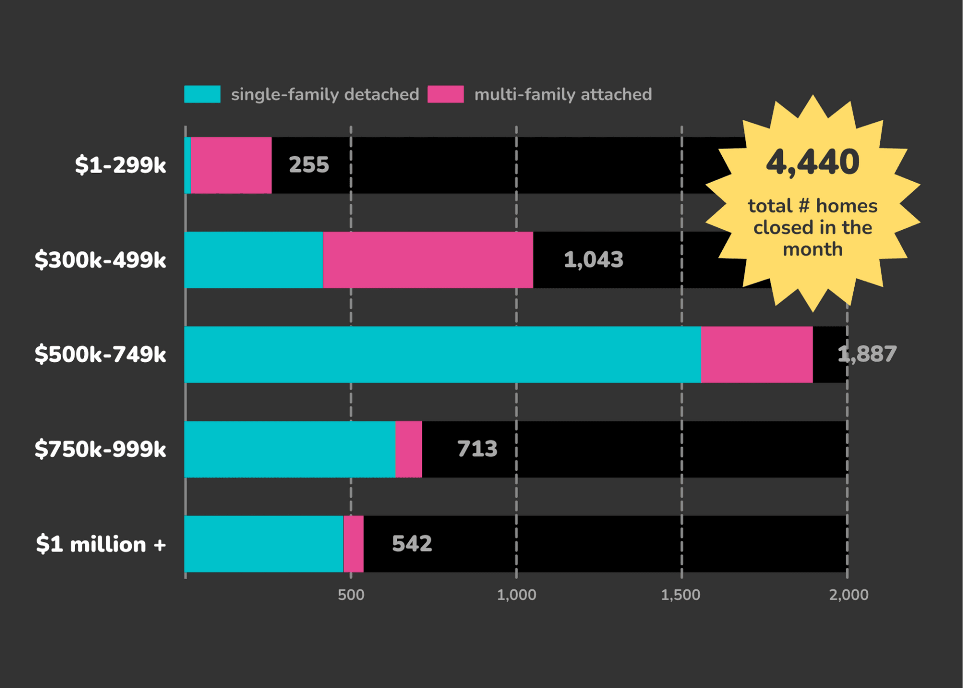
Homes sold were up across all segments, reflecting the inventory bump typical for the Denver Metro market post-Super Bowl.
The chart above is called a “walk”
-
The first box on the left is the inventory we had at the end of the previous month (and thus the start of this month).
-
The second box adds the new listings which became active during the month.
-
These first two boxes give us our total home inventory for the month.
-
The third box is the number of properties that went under contract, which reduces our availability.
-
The fourth box shows homes that were removed from the market without going under contract, which reduces the number.
-
Finally, we are left with the total inventory at the end of the month.
The chart above is a bar chart showing the number of homes sold in the month by price bucket. Blue is the number of detached, single-family homes; while pink is the number of attached, multi-family homes. Charts like this are helpful as they easily show where we see the most activity.