Highlights
New listings were up 31% over the previous month, but still much lower than the 70% increase we normally see from Dec to Jan
While sale prices were seasonally lower, buyer competition remained high, with homes closing on average $12.5k over list price (up $3k from Dec)
Increased interest rates are lowering buying power, but with expected appreciation, that $500k home now may cost you north of $550k if you wait a year
inside the numbers
sales price
$609,132
average sale price for a home purchased during the month
$540,000
half of the homes sold were purchased for this amount or less
$12,470
average amount over list price for homes closed during the month
While the cooling in sale price is consistent with seasonal trends, the competition remained hot with homes closing on average $12.5k over list
days on market
20
average number of days for a home to go under contract during the month
5
half of the homes listed were under contract in this number of days or less
Despite a 2-day uptick in average overall, most homes continue to go under contract after only one weekend on the market
inventory movement
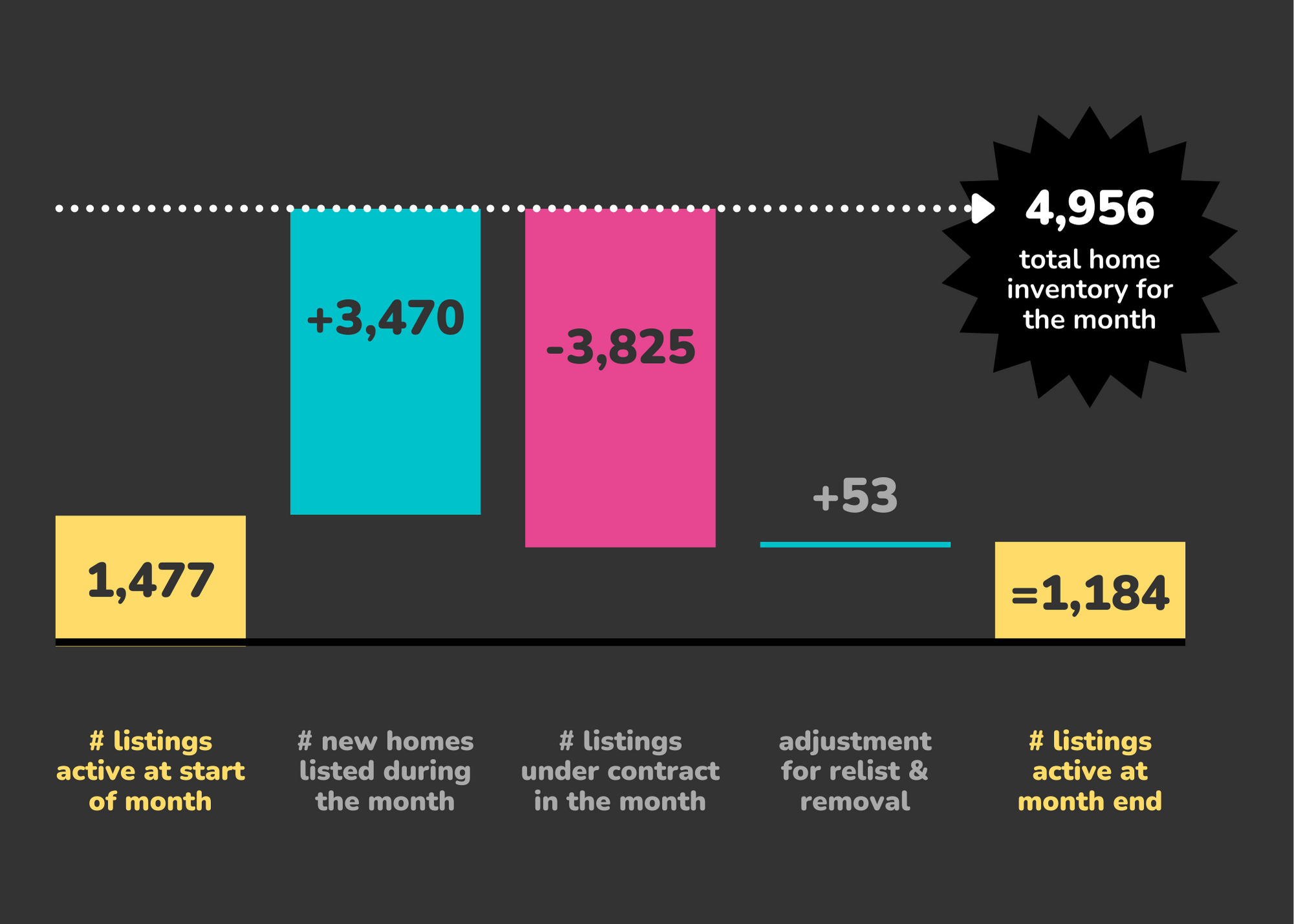
A small increase in new homes listed (+827) could not quench buyer appetite as inventory ended the month at yet another all-time low
⇑ how to read the “inventory movement” chart
The chart above is called a “walk”:
-
- The first box on the left is the inventory we had at the end of the previous month (and thus start of this month)
- The second box adds the new listings which became active during the month.
- These first two boxes give us our total home inventory for the month
- The third box is the number of properties that went under contract, which reduces from our available
- The fourth box shows homes that were removed from the market without going under contract, which reduces the number
- Finally we are left with the total inventory at the end of the month
homes sold
Drops across all segments is to be expected as less homes were listed through the holidays and thus less closings in January
⇑ how to read the “homes sold” chart
The chart above is a bar chart showing the number of homes sold in the month by price bucket. Blue is the number of detached, single family homes; while pink is the number of attached, multi-family homes. Charts like this are helpful as they easily show where we see the most activity.
The Denver Metro Area encompasses 11 counties: Adams, Arapahoe, Boulder, Broomfield, Clear Creek, Denver, Douglas, Elbert, Gilpin, Jefferson, and Park.


Recent Comments