Highlights
New listings and closings were both up slightly from last month, but down for the year overall when compared to this time last year
The 104.75% close-to-list price ratio was an all time high, and correlates to homes closing in February nearly $30k over list price
While interest rates have increased more rapidly than projected this year, the conflict in Ukraine is expected to lower them, at least in the short term
inside the numbers
sales price
$647,776
average sale price for a home purchased during the month
$575,000
half of the homes sold were purchased for this amount or less
$29,374
average amount over list price for homes closed during the month
With continued lack of supply and high buyer demand, home prices and close-to-list price ratio (104.75%) rose sharply in February
days on market
15
average number of days for a home to go under contract during the month
4
half of the homes listed were under contract in this number of days or less
As has been the recent trend, most homes continue to go under contract after just 1 weekend on the market
inventory movement
While February saw another slight uptick in inventory, there have been 12.44% less homes listed in 2022 than this time last year
⇑ how to read the “inventory movement” chart
The chart above is called a “walk”:
-
- The first box on the left is the inventory we had at the end of the previous month (and thus start of this month)
- The second box adds the new listings which became active during the month.
- These first two boxes give us our total home inventory for the month
- The third box is the number of properties that went under contract, which reduces from our available
- The fourth box shows homes that were removed from the market without going under contract, which reduces the number
- Finally we are left with the total inventory at the end of the month
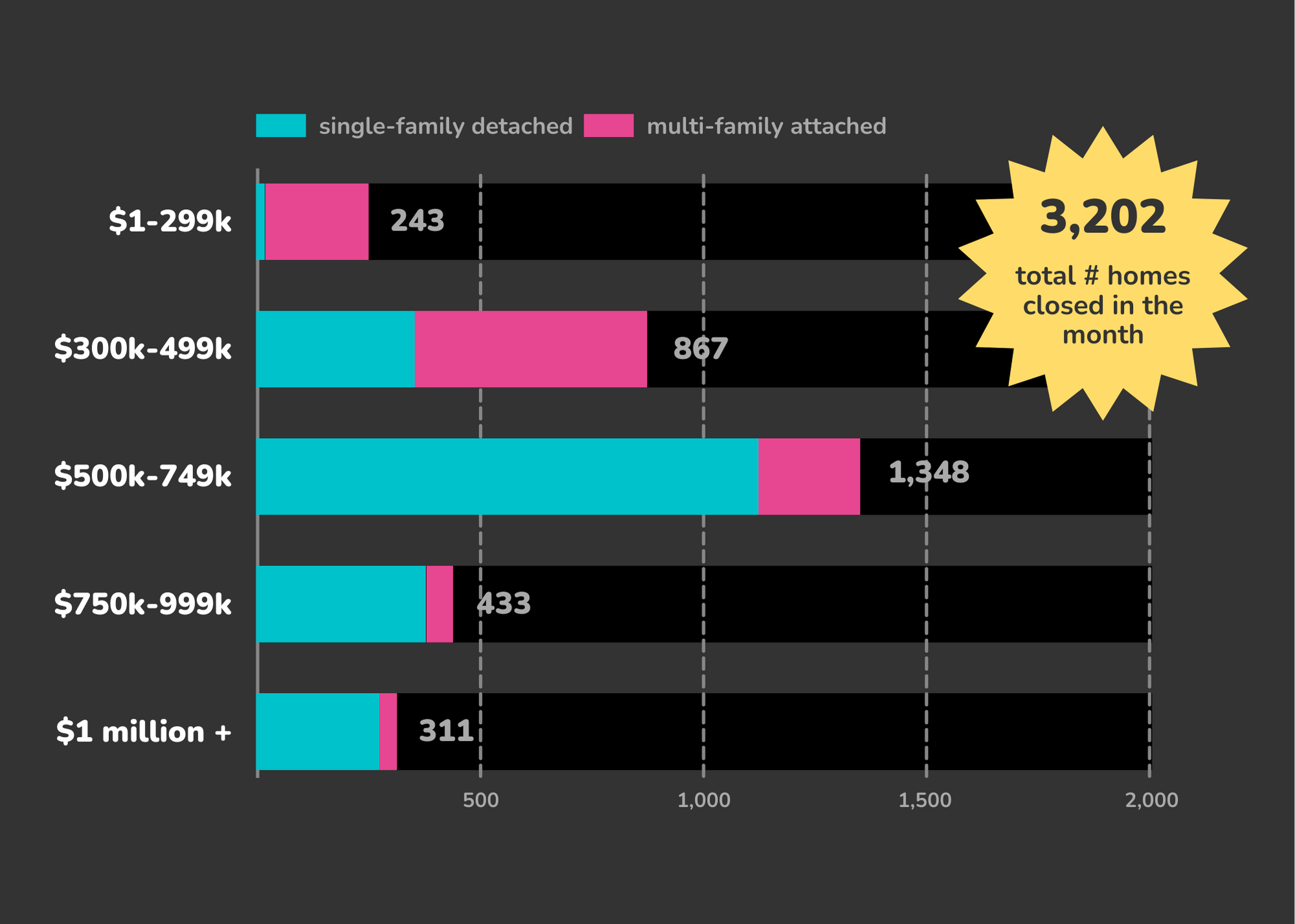
homes sold
A slight uptick for the month, normal after the Super Bowl, but overall we’ve had 13.31% less closings in 2022 than this time last year
⇑ how to read the “homes sold” chart
The chart above is a bar chart showing the number of homes sold in the month by price bucket. Blue is the number of detached, single family homes; while pink is the number of attached, multi-family homes. Charts like this are helpful as they easily show where we see the most activity.
The Denver Metro Area encompasses 11 counties: Adams, Arapahoe, Boulder, Broomfield, Clear Creek, Denver, Douglas, Elbert, Gilpin, Jefferson, and Park.


Recent Comments